Background
We like to think of office buildings as neutral spaces- but comfort and safety, like everything else, are not equally distributed. From crash test dummies modeled soley after men to algorithms that reinforce racial biases, design has historically upheld systems of oppression as the world works exactly as we designed it.

The problem
Indoor environments are no exception. The models used for predicting thermal comfort are 1960s-era measures that relied heavily on the experiences of college-aged men from northern Europe and America and are unrepresentative of diverse populations.
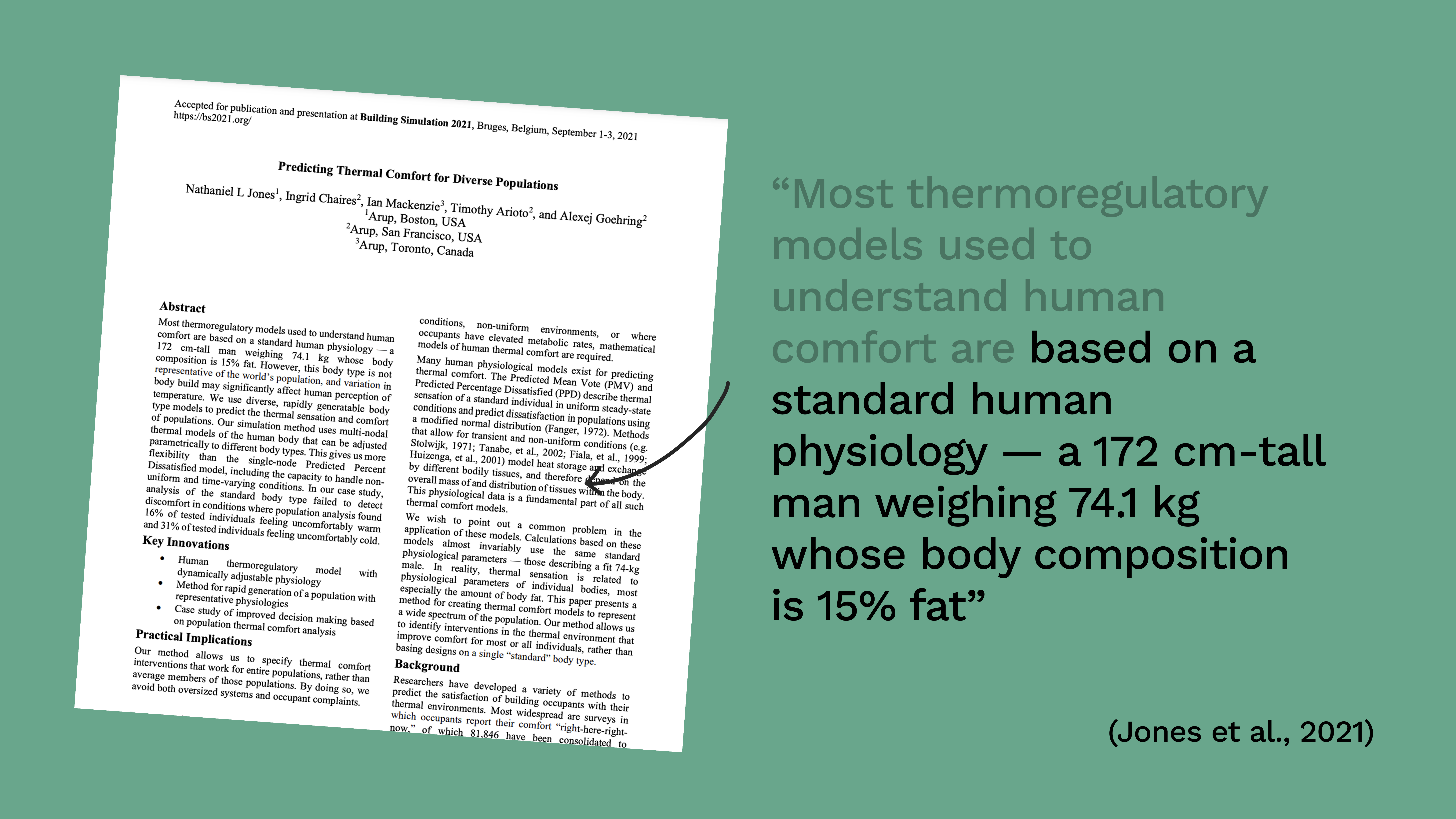
With outdated models being so central to how we think about indoor environments, it’s not surprising that it fails to serve anybody. This is because designing for a single ‘average person’ is not equitable as that person simply does not exist. Yet, buildings are cooled, heated, and ventilated as if they do.
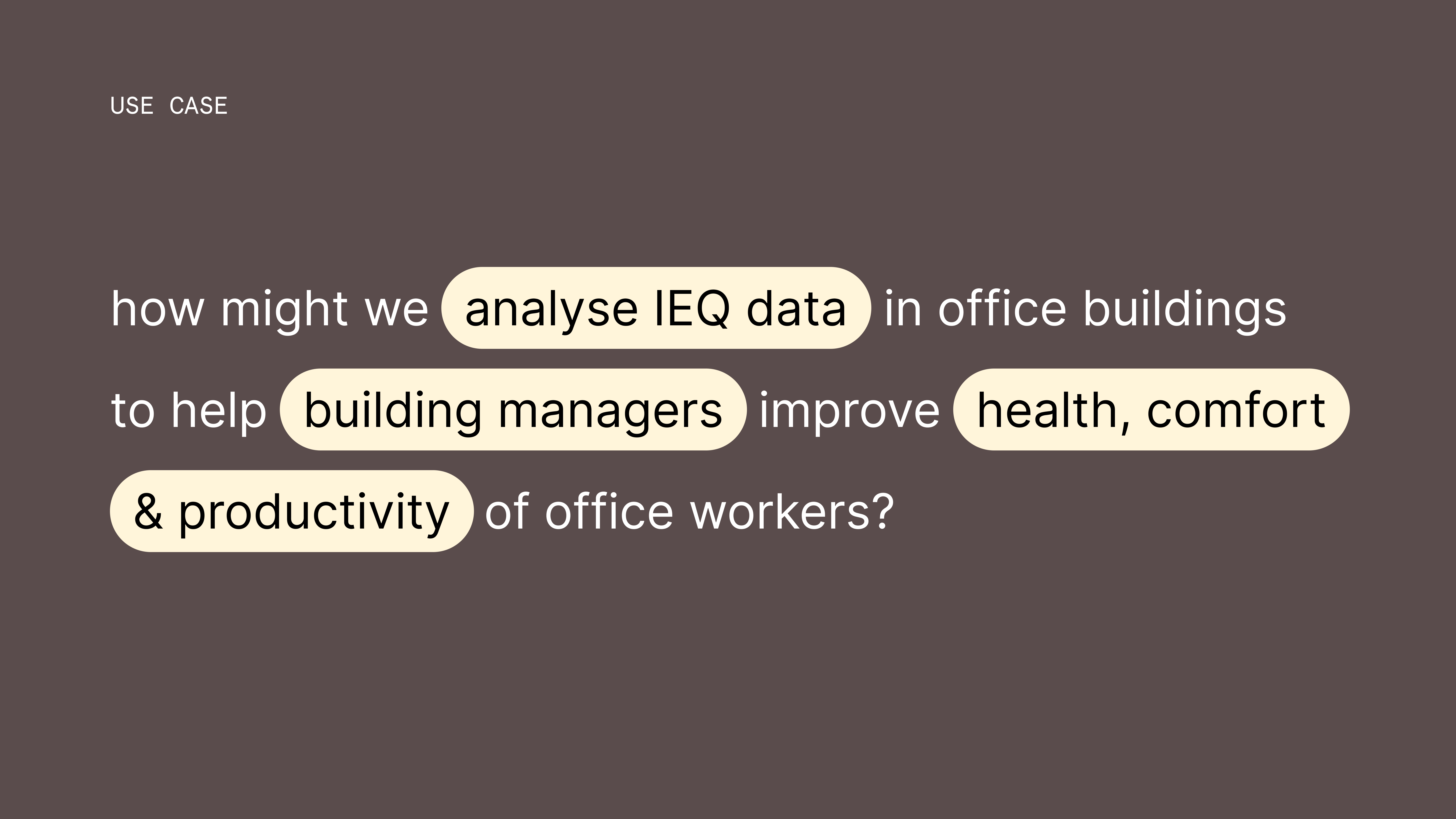
So, how can we better represent and design for an entire population?
Brief
In collaboration with the Indoor Environmental Quality (IEQ) Lab here at the University of Sydney, I’ll be analysing a year’s worth of data collected from a real office building with the goal to develop software that empowers building managers to create fairer, more comfortable indoor environments for all.
I approached the analysis in three phases to ensure insights were grounded in real world readings. After some intense data wrangling with pandas, I used Plotly.js to build the charts you’ll see next in the wireframes :)
Concept walkthrough
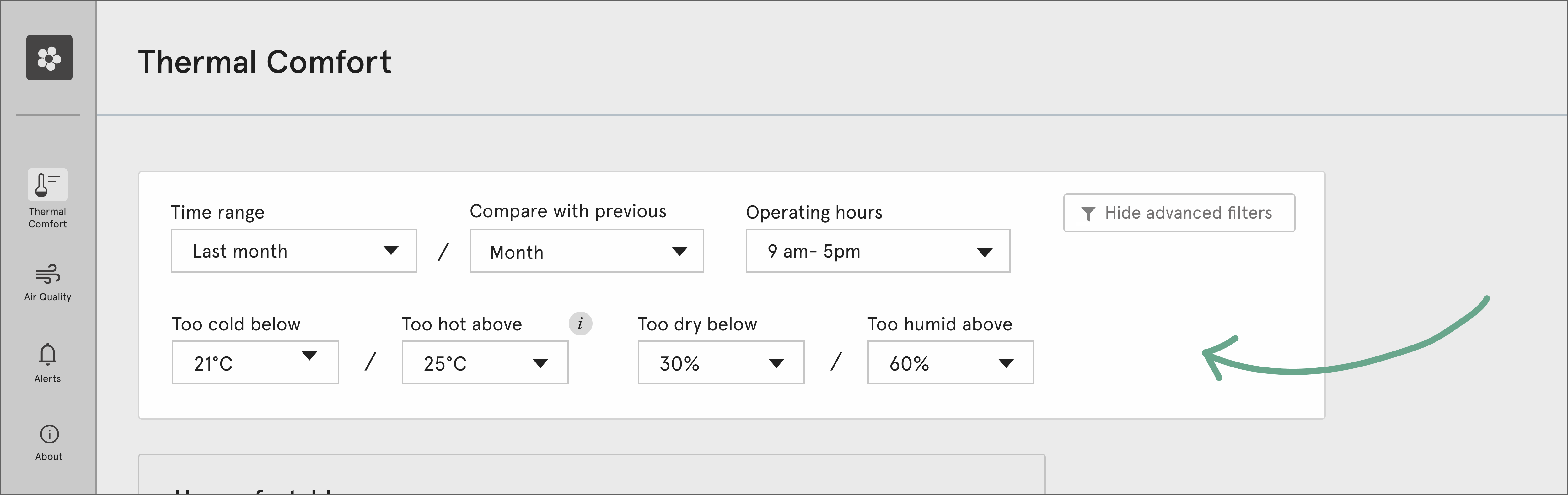
In the application, users can explore any period of time they want, compare it to previous periods, and customize operating hours including comfort parameters for more focused insights.
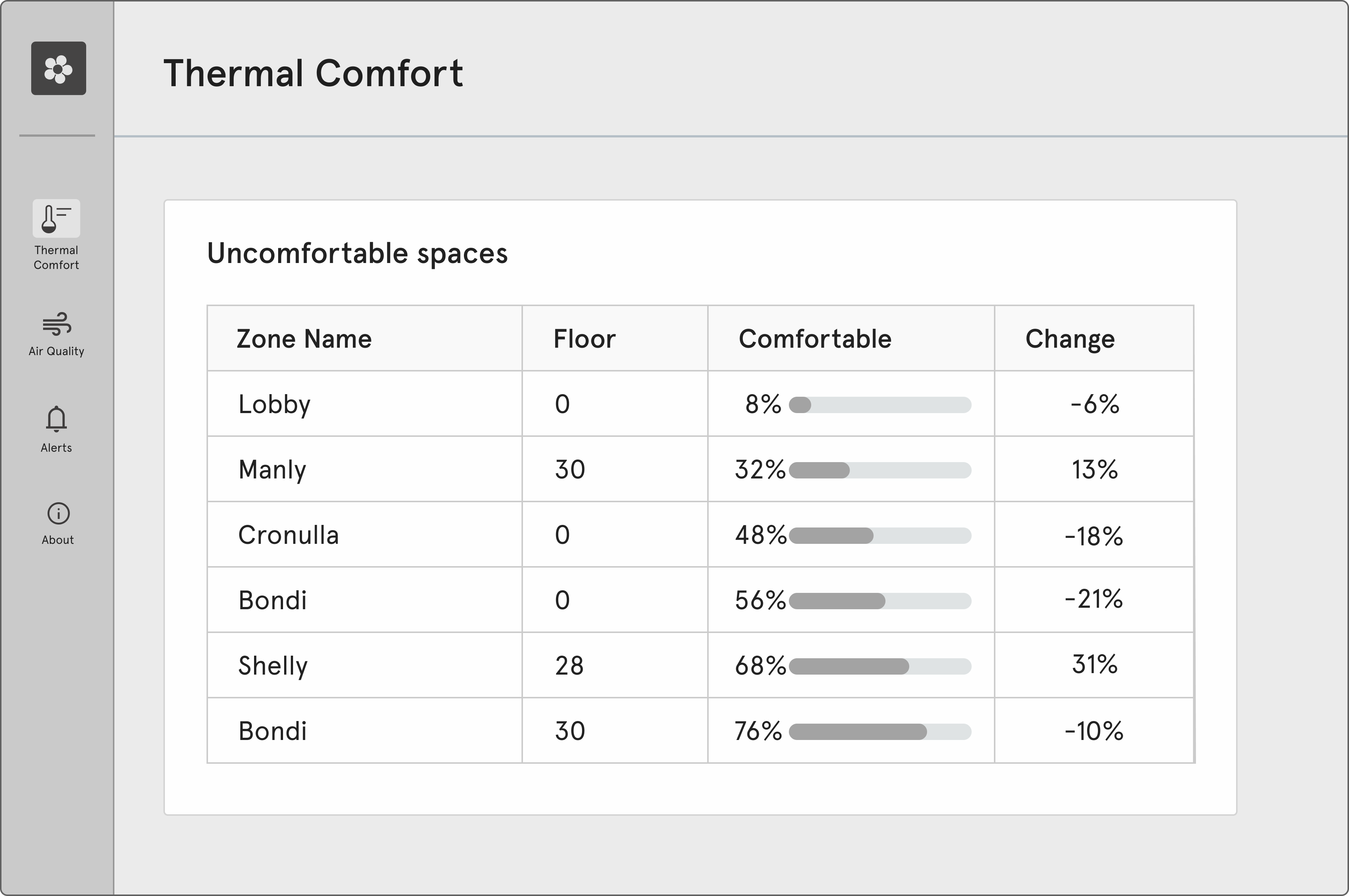
A leaderboard then highlights the least comfortable spaces in the portfolio, showing the percentage of time each space met comfort standards and how that changed from the previous period.
Understanding Averages, Variability & Trends
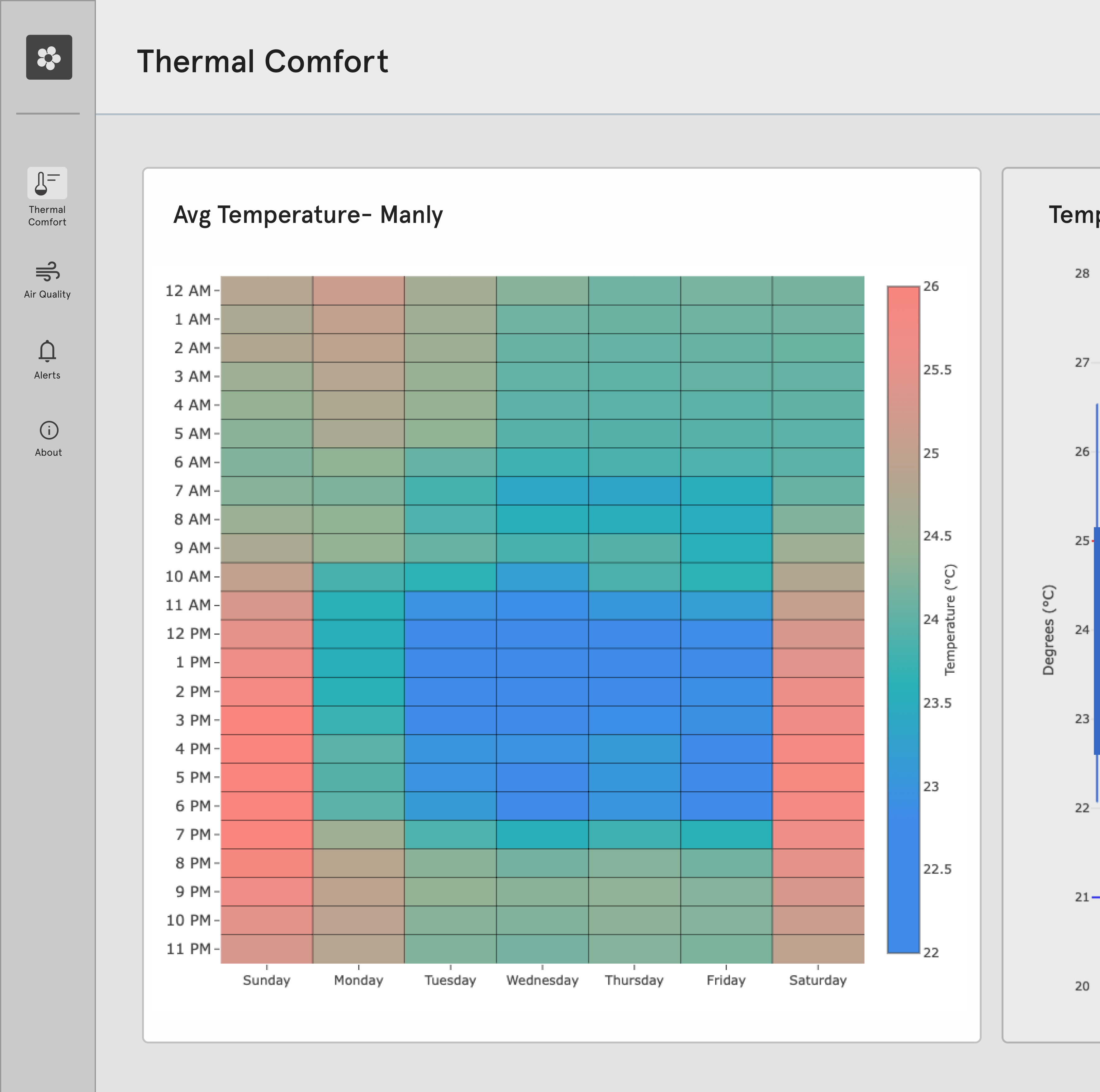
The goal of thermal comfort, ultimately, is to reduce complaints while minimizing energy use. To support this, a heatmap normalized by day of the week is shown to help identify HVAC scheduling patterns and potential energy savings such as unnecessary heating or cooling on the weekends. This is especially useful in spaces that rely on mechanical HVAC systems (like most office buildings do).
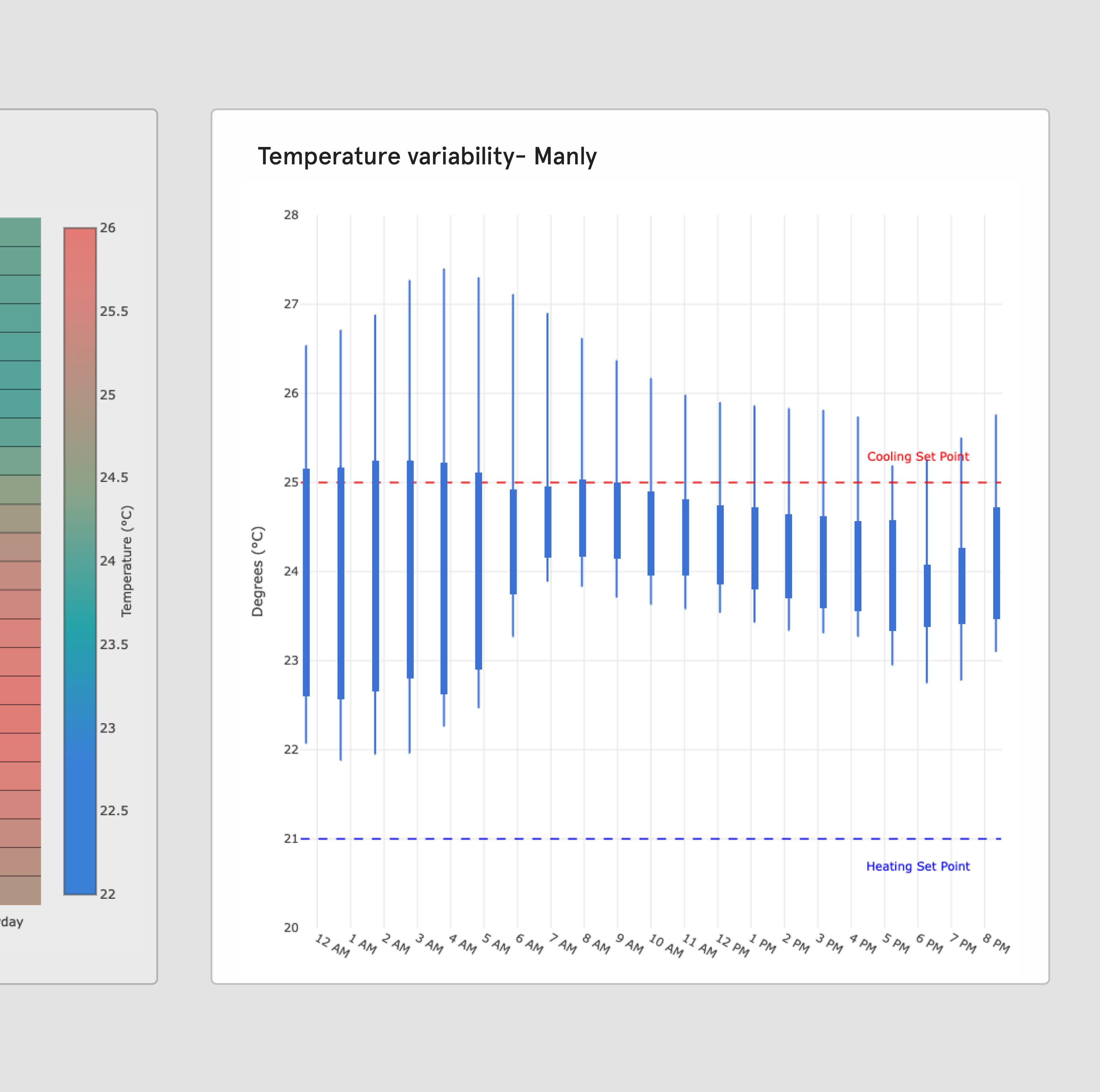
To understand how stable temperatures are throughout the day, I use a box-and-whisker plot, normalized for an average 24-hour day. In this space, variability is quite high — meaning conditions can shift from comfortable to too hot at any time. Ideally, variability should stay low during operating hours, and this chart helps users quickly identify when that’s not the case.
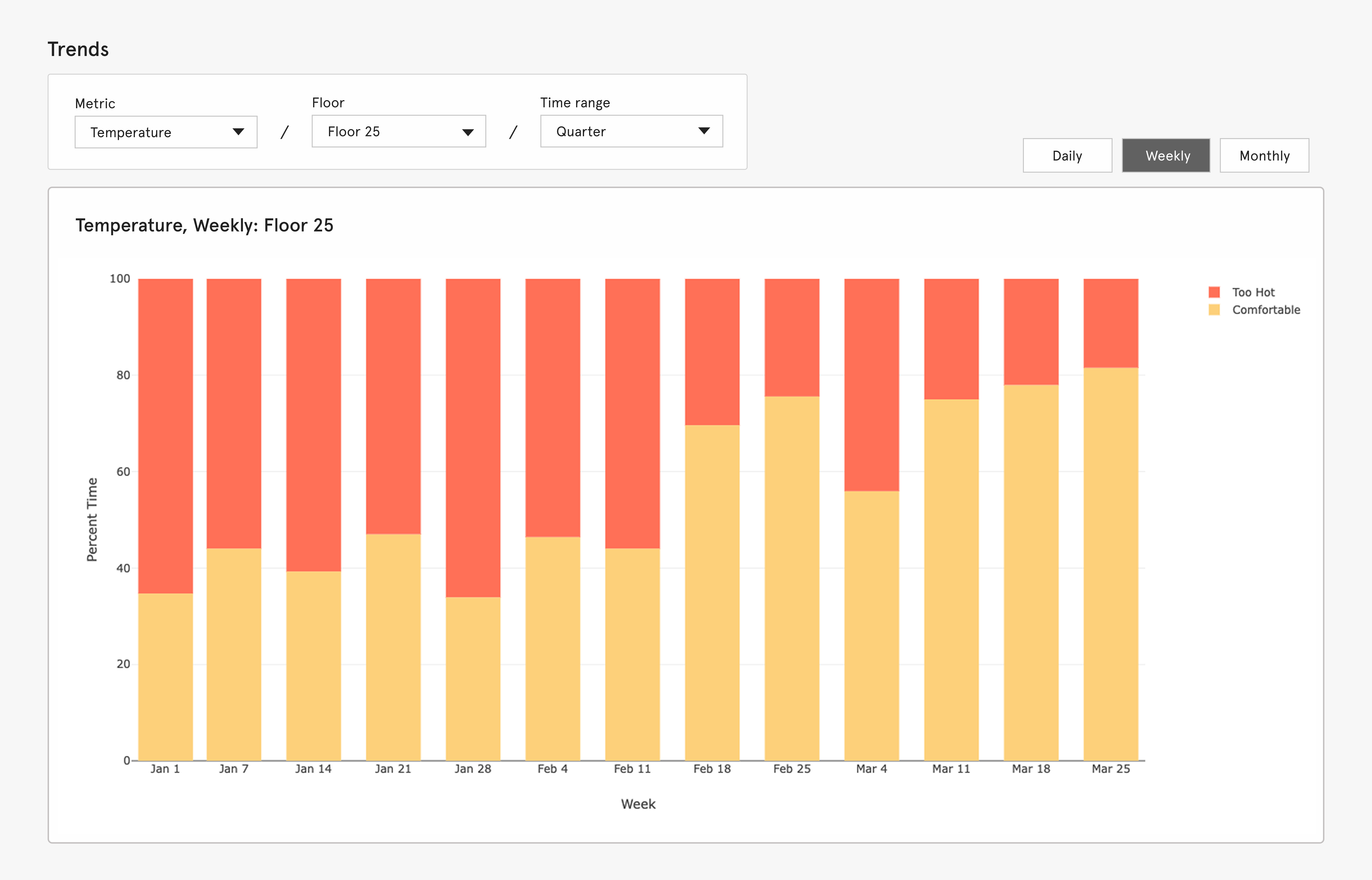
Trends is a stacked bar graph that shows the percentage of time a space was too hot, too cold, or comfortable over any selected timeframe. Analyzing 90-day periods helps reveal seasonal patterns—for example, spaces running too warm in the summer
Thermal comfort for diverse populations
The most important thing about design is how it relates to people and this banded range plot visualises thermal comfort zones for diverse populations based on scientific literature. Older females prefer warmer temperatures, while leaner individuals are more comfortable in cooler environments. Even among “average” builds, comfort levels vary in both range and placement. The takeaway? We need faster-responding systems like fans and customizable features that occupants can control themselves.
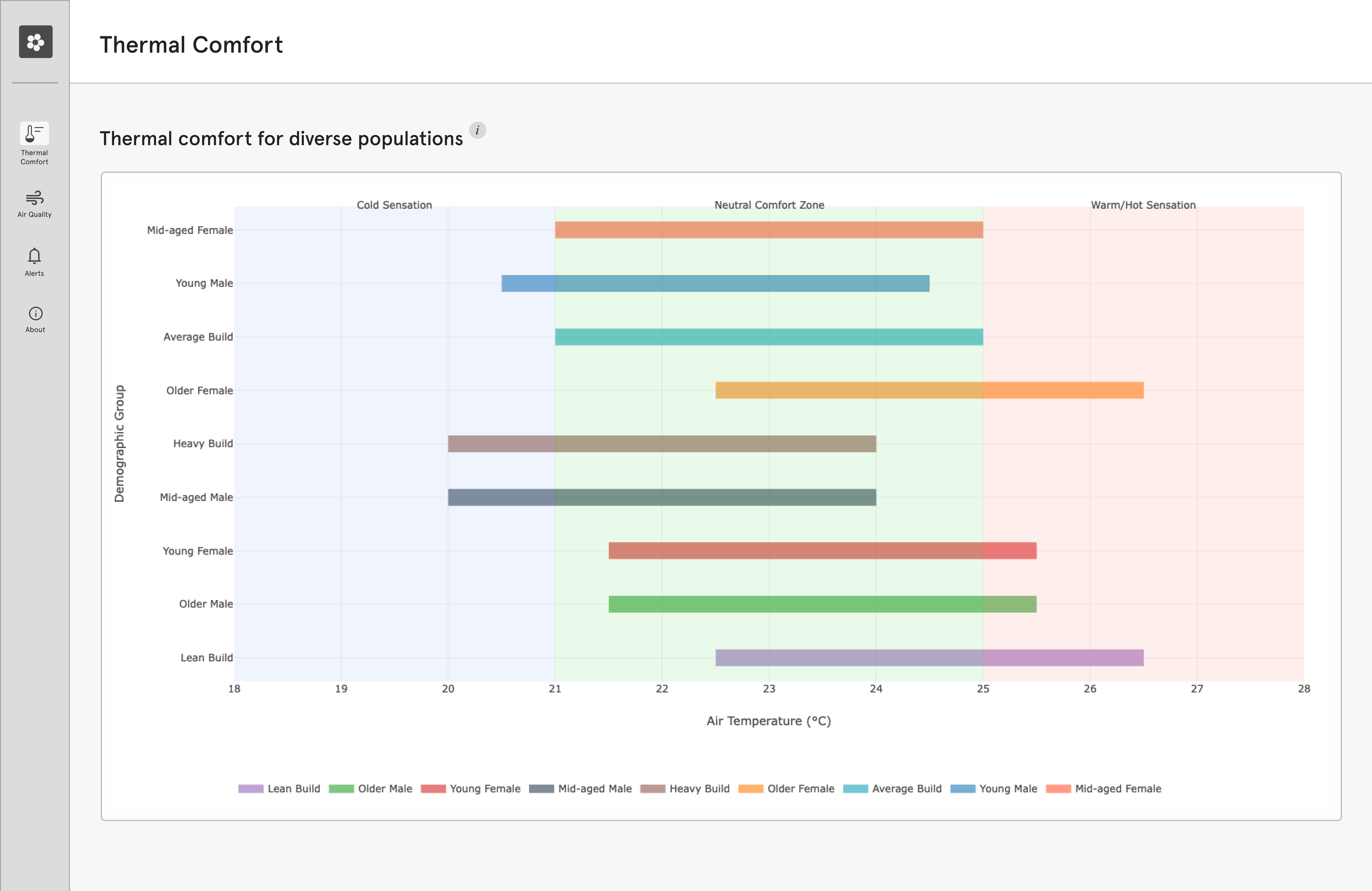
Traditional IEQ systems lack this, and often display data on a TV, reinforcing a top-down dynamic. In contrast, this application integrates widgets into employees’ devices, offering real-time, context-aware suggestions based on user preferences, like moving to a warmer zone if your profile suggests that you run cold. These also allow for feedback loops, empowering them to voice discomfort and helping building managers make informed, people-centered decisions WITH office workers, and not FOR them.
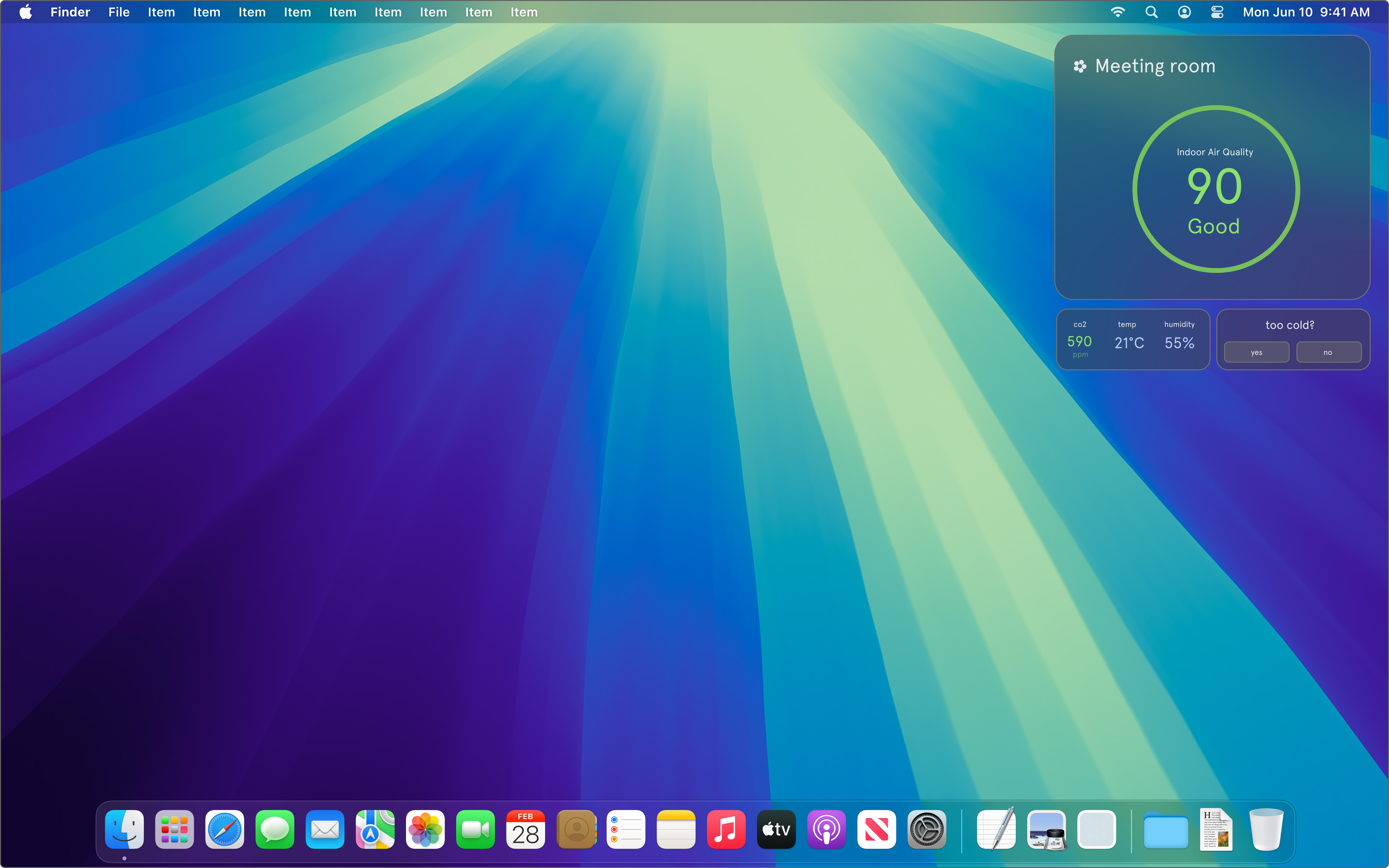
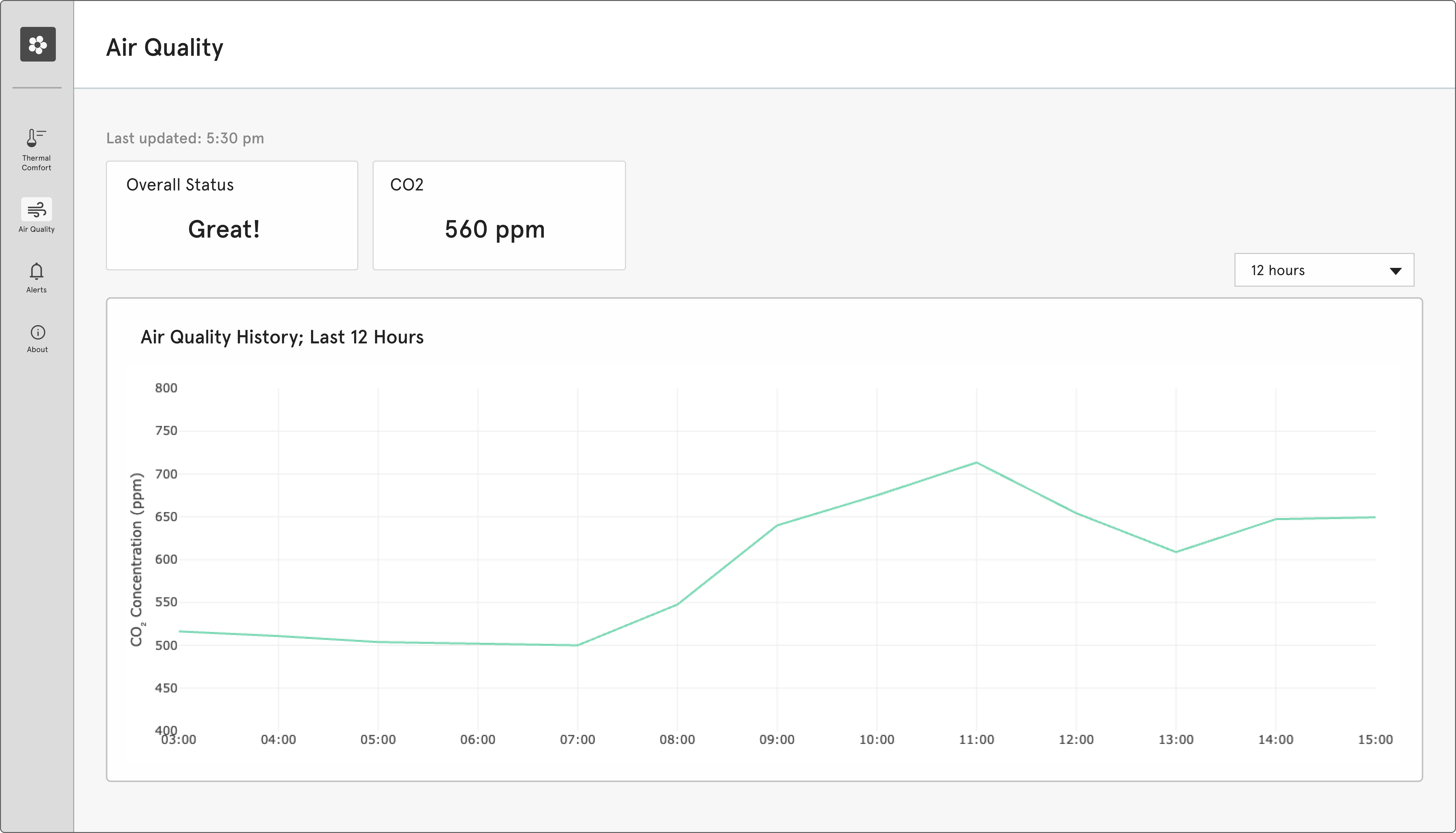
Air quality
Air quality is also critical for wellbeing. This time series chart tracks its history, allowing users to quickly explore data from different devices and spaces to pinpoint problem areas. The current view is filtered to the last 12 hours, during which air quality remained okay :)
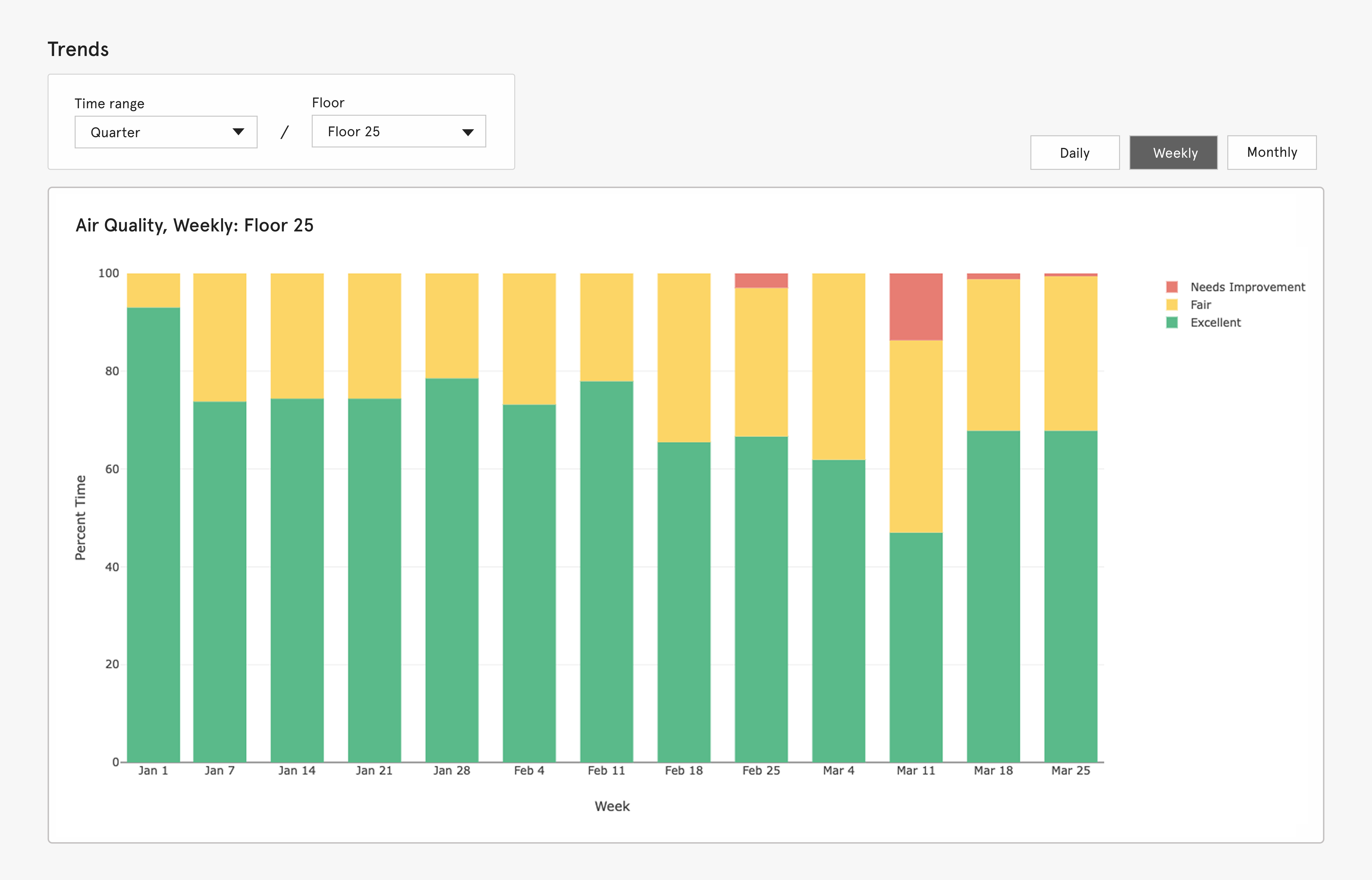
Longer-term air quality trends are also available- showing percent time the air was good or bad over any selected timeframe, allowing building managers to identify patterns and proactively address issues.
Epilogue
This project is very much a work in progress. There’s a long way to go— testing things out, making mockups, running usability sessions, and just figuring out what works and what doesn’t. But check back in June '25 for the final solution and full case study to see how I fare :’)